Monday, 10 October 2016

Front Cover and Contents Page


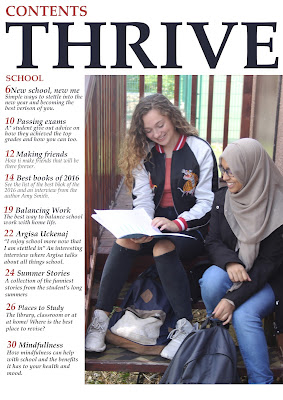
Here are my final front cover and contents page.  Overall, I am happy with my magazine as I this was my first ever time creating one and using Photoshop. I am pleased with how the front cover look like and how I used colour to make it appear interesting. The contents page is neat and simple, just the way I wanted it. If I was to improve one thing it would be to incorporate some more green into the contents page to make it look more like it is part of the magazine and to match the front cover more.

Image Manipulation

Monday, 3 October 2016

Lay Plan Comparison

This is my lay plan and my finished magazine cover

Similarities are:
  • The layout is still the same. I wanted to have the model as the center of the picture regardless of who the model was as I believe it keeps it looking realistic and formal.
  • The angle of gaze. This is still straight at the camera at the camera as I wanted the image to draw the attention of the audience
  • The positioning of the text. I kept the text in the same place as I wanted it to surround the model in the image.
Differences are:
  • The model is different. When creating my magazine, I planned to use a model who was wearing a headscarf. When it came down to the day to take the picture, she wasn't available so I had to change the model and use someone else. I don't think it negatively affected my work.
  • The model is the picture I used was a lot more close up than I wanted it to be. That made it quite difficult to place text around it as there wasn't much space.
  • The model is not holding books. I chose to not have her holding books as I wanted it to be as simplistic as possible. The jacket the model is wearing is already colourful enough so I didn’t want extra colour to further complicate it.
  • The masthead ended up being a lot smaller than I had planned it to be as with my lay plan, the model was wearing a headscarf, so it was a better choice to let it cover some of the head. However with my model, I couldn't so decided to make the text smaller.

Masthead Manipulation

Chosen photographs

Flat Plan


Here is my front cover. It will feature a girl holding books in her arms in a mid shot and the angle of gaze will be straight ahead. The fact that she is holding books will link to the idea of it being a school magazine. The masthead will be big across the top of the magazine and will over lap onto her head in a way that doesn't cover the model's features. There will be text around the picture in certain places to make it look like a proper and formal magazine cover.

Here is my contents page. I took inspiration from ones I found online from real magazine and noticed that most of them have only one image as the main picture and then text beside or below it. Therefore I decided to use that as my layout. I included the masthead again as it is important to the magazine and the added the word "content"above it so it is recognized as a contents page.

Shot List


Monday, 19 September 2016

Reader Profile

Reader Profile - Autumn Wilson

" Hello, it's Autumn here! I'm 16 and have just started sixth-form, the biggest step I've taken in life so far. It was slightly scary beginning my A-levels and saying bye to my old friends but I am looking forward to the next 2 years, full of exams and lot of homework no doubt. It will be fine though as I am taking subject I enjoy: Maths, Ict and English literature. I have always loved English Literature as it allows me to dig deeper into a writers mind and methodology and so I plan on hopefully doing studying at University. However, I sometimes feel there is limited access for people like me who want to pursue this certain career.
As an English student, I have always loved reading as well as playing tennis and painting. Hobbies likes these help me balance leisure time with work. Sometimes I struggle with getting my timing wrong so I am always on the look out for tips and tricks to help me keep up."

Saturday, 17 September 2016

Magazine Deconstruction

Teen Vogue Magazine Deconstruction

Teen Vogue is an American magazine that is targeted at teenage girls. They feature articles about make up, fashion and celebrity gossip. The copy I deconstructed was April 2013 edition featuring Shay Mitchell.
This task helped my understanding of the features that is included in an average magazine. I now know where things are placed and the purpose of them as well as how they impact the audience.